4 Examples Why Prezi is Superior to Slides for Data Visualization
A savvy business professional knows to include data to justify assertions and recommendations during a presentation. As the classic W. Edwards Deming quote goes, “Without data you’re just another person with an opinion.”
The problem is data and spreadsheet tools like Excel don’t generate graphics with presentation environments in mind—charts are “spit out” using the program’s native output function and most people have trouble manipulating them beyond changing an axis label or chart title.
The resulting charts may be great for in-depth analysis on a handout or PDF, but for a presentation they’re typically too complex and indecipherable for an audience member to comprehend in the few seconds they’re afforded to review the slide. It may seem to be an obvious disconnect, yet presenters around the country continue to hit the export button from their spreadsheet, paste the resulting graphic into their presentation and assume audiences will be able to immediately comprehend the takeaway they are attempting to communicate.
So is the situation hopeless? Should presenters continue to include charts only as an obligatory gesture knowing audiences won’t be able to decipher 20-years of numbers and hundreds of data points from a partially blocked view in the corner of the conference room?
No—don’t give up on your data-driven presentations yet! We believe there is a solution for this data visualization challenge through Prezi—a presentation platform that offers an alternative to the traditional slide-by-slide mentality. With Prezi, presenters can break complex charts into understandable, digestible pieces for audiences using spatial movement techniques to improve audience comprehension.
And since we believe strongly in the power of effective visual aids, we’ve prepared four examples to show you how we transformed complex “Before” slides into data analysis sequences using the Prezi platform.
Design Note: These “Before” examples are not made up for dramatic effect, but appear either as exact or slightly modified reproductions of real-world slides—often created by paid consultants presenting to actual clients. If you’ve spent time sitting through corporate presentations, I’m sure we don’t have to convince you that these types of slides get presented on a daily basis by companies all around the world.
Example #1: Trying to fit everything onto one slide
It’s a classic conundrum when trying to present detailed charts and data on slides: do you try to fit the entire chart on one slide and risk the audience losing the meaning in the complexity of it all or do you try to break the data down piece by piece and risk the audience missing the context and big picture implications?
In this “Before” example, the presenter opted for the “fit everything onto one slide” strategy—combining the total number of survey respondents, their responses to the survey itself and the respondent demographic information all onto one chart. The resulting slide has no obvious takeaway and buries the primary information of value—the survey responses—to the point where the meaning is lost without an in-depth analysis.
Prezi is exciting because it allows presenters to skip the “complexity versus lack of context” conundrum by allowing them to achieve both options. Instead of having to fit everything into one slide, Prezi’s spatial movement allows presenters to show the “big picture” slide and then zoom in on certain pieces of the chart or graphic so the audience can get a better understanding of what the information is trying to communicate.
In our “After” example, we start with a slide featuring the same information from the PowerPoint example, but then we zoom in on the primary takeaway—the survey responses—and then afterward zoom in on the respondent demographic slides and finally zoom back to the original starting slide.
This spatial movement sequence allows the audience to get an initial impression of the information, evaluate each piece individually and then finally review them all together again so they can see how the information fits together contextually.
Example #2: Linking slides together toward one premise
A second challenge emerges when presenting a series of charts or concepts: how does a presenter link them together in a way that’s clear and understandable for an audience?
Slides are by nature independent of one another and although presenters can try to order them in a logical sequence, it can still be difficult for audiences to remember how the information on the current slide connects with the slides presented three slides before, two slides before and one slide before without aggressive note-taking or a photographic memory.
In this “Before” example, the same research study from Example #1 shares four new slides with additional data from the respondent survey. While each slide does have standalone value, ultimately the entire series is helping to answer the core question of “What is the value of presentations when bidding on new business?” While this slide-to-slide relationship may be clear to the presenter, it can be difficult for an audience to perceive visually without significant verbal assistance.
In our “After” example, no superpowers or in-depth narration is required for the audience to easily recognize how each of the individual slides are linked together to demonstrate “The Value of Presentations.” Just like in Example #1, the sequence starts with an overall view with a clear question or premise, then zooms in on the individual pieces supporting the overall premise, then zooms back to the starting point so the audience can reconsider the point having reviewed all the supporting information.
This type of guided logic sequence visually communicates to an audience how each graphic connects to and supports the others instead of a sequence of slides that can be misinterpreted as unrelated.
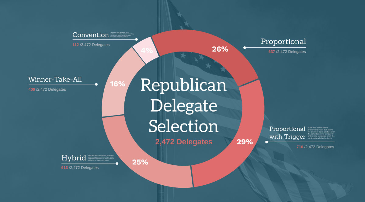
Example 3: The multi-layered approach to comprehension
We know political fatigue sets in for many Americans months (or even years!) prior to a presidential election, so don’t be dismayed by the theme—we promise to keep the analysis focused on effective data visualization!
Here’s the scenario in this “Before” example: there are three columns of information with interesting insights—two of the columns feature numbers and one features text. The challenge for the presenter is which of these columns take priority on the slide design: if the text is featured in a format that makes it easy to read and align, then the slide risks losing the impact of the statistical breakdowns (exactly what happens in this example). On the other hand, if the presenter decides to feature the numbers by creating a graphic like a pie chart, then it becomes difficult to effectively include the descriptions of the Delegate types—once again hindering audience comprehension of the overall takeaway.
Prezi’s spatial movement advantage allows our “After” example to offer a bit of a hybrid solution—the slide starts with a pie chart that features the numbers in a more meaningful way and then zooms in on each segment of the chart so the audience can easily read the descriptions and statistics associated with each Delegate type.
The audience benefits from being able to see the overall context while also being able to review each piece of the equation more closely to ensure understanding.
Example 4: Reviewing previous slides in new contexts
In this example we’ve outlined a scenario that challenges business on a daily basis—a presenter shows a chart on one slide, shows a second chart on another slide, then wants to share a slide featuring both charts for a simple comparison. Easy enough, right?
From a technical perspective, copying and pasting both charts onto a new slide is usually not a major hurdle. The challenge, however, can be visually communicating to the audience that those two charts are indeed the same charts shown previously.
To fit two charts onto the same slide, font sizes may need to be adjusted, columns may need to be resized and formatting may need to be modified to the extent that by the time all those changes are made, the two charts may not be immediately recognizable as the previous examples. And even if the presenter is able to successfully copy both charts onto one slide while maintaining their look and feel, will the audience be able to comprehend the charts at their reduced sizes?
In this Prezi example, we start with a slide focused on a company’s 2015 quarterly performance numbers, then shift to a second slide with the 2016 numbers. Rather than trying to create an entirely new slide with modified versions of both of these charts, with Prezi we can simply zoom out to show both in one slide (or frame, to use the official Prezi terminology).
To enhance the comparison, we’ve even added a middle column on the final slide that shows the year-to-year performance differentials. To the audience, both charts are immediately recognizable in this final slide because they haven’t been modified from their original designs but are simply featured from a new zoomed-out perspective.
—-
So what do you think? Are you convinced Prezi can be a powerful presentation tool for data visualization?
Use the SHARE buttons on the left side of this page to let us know your feedback!
If you’re interested in learning more, check out our PREZI DESIGN or PREZI TRAINING pages!