Create Amazing User Conference Keynotes – Part 1: VISUALS
This is Part 1 of a 4-Part Series. Get immediate access to the Full Digital Report!
In a world where most interaction occurs digitally, user conferences are an opportunity for tech companies to gather their clients and partners together for 2-4 days of presentations, workshops and good ol’ fashioned networking. If everything goes smoothly, these events can create momentum that lasts through the year.
Naturally, companies invest considerable time and money into making the experience memorable for attendees: destination cities, celebrity speakers, elaborate stages, event branding, music, lights, swag, the works. Entire teams work year-round to ensure the event is successful.
And then at last it’s time for the keynote presentation: the launch point of the event, the opportunity for executives to inspire the crowd and share their vision for the industry…and so many fall flat.
How can you prevent this from happening?
VISUALS
Create a keynote presentation, not just PowerPoint slides
Business presentations usually feature three elements: the presentation content, supporting visuals and the presenter’s speaking style—message, design, delivery.
Of course, it’s possible for a speaker with a compelling message and exciting delivery to be successful without slides at all. When it comes to user conferences though, supporting visuals play an amplified role because of the massive screens displaying the speaker’s slides that inevitably attract the audience’s attention (and scrutiny!).
How do you make sure your visuals are worthy of a keynote presentation?
Craft a Visual Narrative
Most slideshows feel like a deck of cards: each has a templated look with opportunities for minor customization around things like number and suit. Traditionalists applaud this approach because it establishes brand consistency and appeases the footer-engulfing legal department.
When it comes to keynotes though, you should aim for a presentation that feels much more like a video than a deck of cards, with each slide flowing into the next to establish clear logic flows for the audience. Instead of starting with a blank slide, duplicate your previous slide and build from it to create a visual narrative that intuitively communicates content relationships for the audience.
Remember, every time you flip to a slide with no connection to the previous slide, the audience has to completely reassess and contextualize the new information—a tiring process over the course of 30-60 minutes.
Check out how we crafted this Western Union Money20/20 keynote presentation to flow from slide to slide:
Get Dynamic
Traditionalists discourage the use of special effects in presentations because they’re afraid of distracting the audience or appearing amateurish. While we can all agree the Blinds transition in PowerPoint should be put out to pasture, the reality is there are a few simple effects that can significantly enhance your presentation content, especially at a user conference where production value expectations are higher.
For example, by inserting a video in the background of your slide – perhaps of a shimmering light or floating molecules – you create a live “in-progress” impression on your audience that helps hold their attention instead of a static slide that implies “complete” and encourages them to look away once they’ve scanned it. You can also leverage new PowerPoint features like the Morph transition and 3D file support to give your presentations an unexpected look that will stand out among the dozens of slideshows they’ll view that week.
Designed effectively, a dynamic presentation improves the audience’s perception of the speaker and her company’s grasp of technology – a not insignificant benefit at a tech user conference!
Check out the layers of dynamicism we baked into this Blue Prism World keynote presentation:
Complement, Don’t Compete
Since so many organizations use PowerPoints more for documentation purposes than for in-person meetings, it’s inevitable slideshows often read like text-heavy brochures instead of visual aids. When it comes to keynotes, resist those habits and design slides that are highly visual while keeping text to an absolute minimum.
Think about it: you can’t read the newspaper and listen to the radio at the same time, so a presentation that requires audience members to read competes directly with their ability to listen to the speaker!
As a bonus, highly-visual presentations are more easily understood by international attendees not reading in their native language.
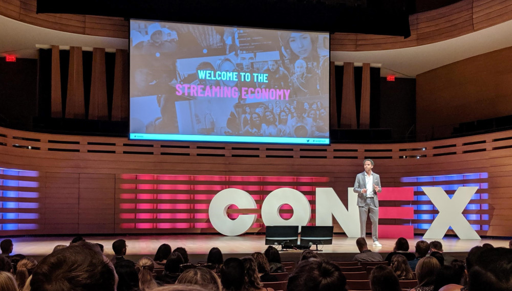
Check out how the visuals complement David York’s narrative at TEDx Salt Lake City:
Want help crafting visuals like these to make your user conference amazing? Connect with us!
This is Part 1 of a 4-Part Series. If you want to see the Full Digital Report, check it out here!