Our “Before & After” Presentation Designs Featured on the Prezi Business Blog
Want to see more of our presentation designs? Check out our Portfolio page!
As a complement to our recent webinar, we’ve partnered with Prezi to share examples of real-world presentation projects redesigned and reimagined through the Prezi platform.
The feature includes “before and after” examples from 3 business presentation projects we’ve worked on for clients – showcasing how to redesign bullet point lists, create visual versions of agenda slides and structure frames together so they flow into one cohesive proposition instead of fragmented, individual slides. This edition is focused on concepts, but stay tuned for our next “Before & After” feature which will include 4 examples of data visualization designs.
From the article:
Puffingston CEO and Prezi expert Luke Goetting recently ran a webinar with us, explaining how to transform ineffective business presentations into dynamic prezis. Luke and his team regularly take their clients’ existing slide decks, chock-full of traditional charts and graphs, and transform them into zestful prezis. In this post, we are going to dive a bit deeper into his examples of real life “before” and “after” presentation transformations. Take a look to get some inspiration for your next presentation redesign.
Below are the “Before” versions, click here to check out our “After” redesigns!
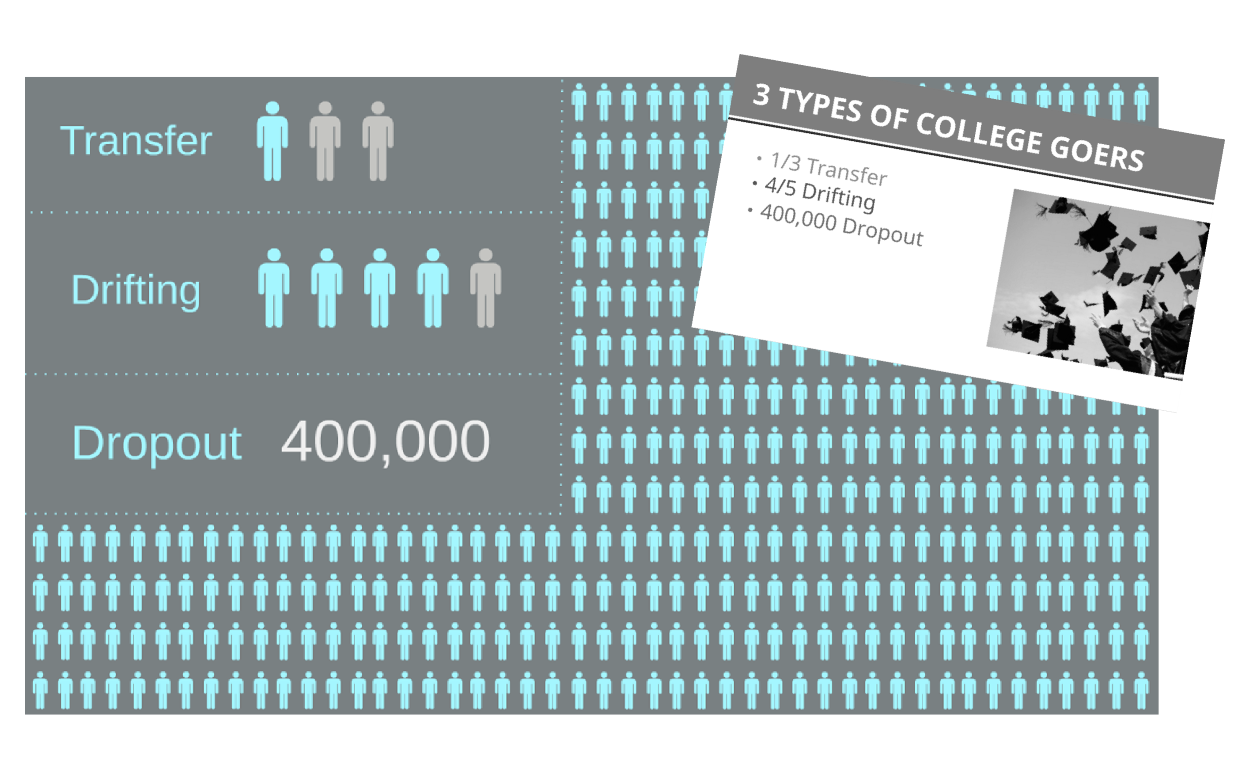
“BEFORE” Design #1:

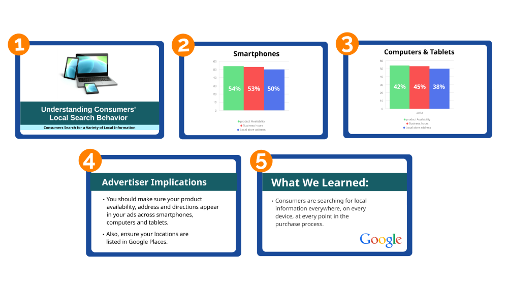
“BEFORE” Design #2:

“BEFORE” Design #3:
CLICK TO CHECK OUT THE “AFTER” REDESIGNS!
For more examples of business presentation designs, check out our portfolio page