Puffingston Serves as Judge for First Annual Prezi Contest for Charity
We recently partnered with another Independent Prezi Expert company wOw Prezi to act as a judge for their First Annual Prezi Contest for Charity.
wOw Prezi invited all their non-designer staff to design a Prezi featuring a charity of their choice in an effort to get them more familiar with the platform and raise awareness about a lot of great causes! The winner was to receive a $100 donation for their charity as well as an offer for the charity to receive a free Prezi design.
Seven wOw Prezi staff members submitted presentations and our own Luke Goetting, presentation specialist here at Puffingston, reviewed them all to select the winner of the contest.
Check out all the entries here
As part of the evaluation process, Goetting outlined four criteria Puffingston believes are most important when creating a Prezi:
Story: Does the Prezi do a good job of explaining what the charity is, the work it does, and how people can get involved? Telling a great story is critical for any presentation and allows the audience to really make a connection with the presentation content.
Prezi Concept: Does the Prezi introduce a good framework / “big picture” at the beginning that previews the content for the audience and allows them to track the progress and important sections of the presentation? Bonus points if the framework tied into the theme of the presentation! One of my favorite Prezi features is the ability to turn the boring “Agenda” slide into a visual scene that previews the presentation and then zooms in and out of the content—providing meaningful movement to the audience and allowing them to come “along for the ride.”
Prezi Execution: Does the presentation use Prezi’s movement and zooming capabilities for good (meaningful movement, sectional transitions, subtle shifts to build upon the previous point, adding a “big reveal” at the end) and not evil (over-zooming, over-rotating, meaningless movement, “Death by Prezi”)? Canvas movement is a powerful Prezi feature that allows presenters to connect with the audience in ways slide-based tools cannot, but it can also be abused by presenters who use so much movement that it becomes meaningless and essentially makes the presentation a PowerPoint with extreme transitions.
Design: Does the presentation do a good job of featuring engaging images and multimedia to increase audience engagement while avoiding overloading frames with text? Images and other multimedia are great ways to connect with the audience and really allow them to find a deeper understanding of your presentation content. Powerful visuals are the foundation of any engaging presentation, not frames or slides full of text.
Contest Results
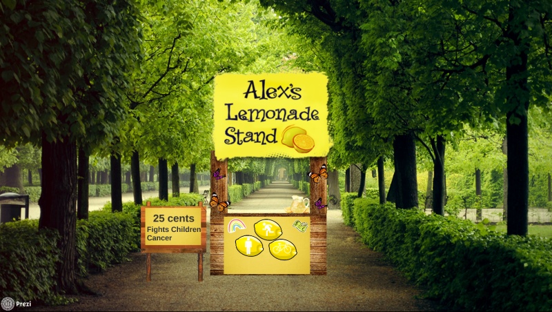
After evaluating all the Prezis on those four criteria, Goetting selected “Alex’s Lemonade Stand Foundation” by David Wilks as the winner of the First Annual Prezi Contest for Charity.
Check out the full competition results here
We want to thank wOw Prezi for inviting us to help out with the contest and we look forward to working on more events in the future for great causes!