4 Things Every New Prezi User Should Know
Contributed by Lawrence Ingerly
Looking for more new Prezi user instruction? Check out our free training videos!
Working in business development for an Independent Prezi Expert company, I’m constantly talking with people about the Prezi presentation platform. Whether it’s discussing Prezi’s capabilities with prospects, reviewing scripts with clients or communicating ideas with our design team, it’s important I know my stuff. Before coming onboard with Puffingston I was still relatively new to Prezi though, so from day one I quickly set out to learn as much as I could!
Being taught by experts is a great way to learn a new platform. Even so, I found myself suffering from the prototypical “new-user-syndrome”—or NUS as I like to call it. NUS has a variety of symptoms ranging from rampant over-excitement to utter frustration and dismissal—a whirlwind of emotions I experienced personally during my first exposure to the Prezi canvas! With the help of the experts however, I was able to overcome brief periods of frustration to create my first complete Prezi presentation (woohoo)!
Interestingly, what I found most valuable from my first Prezi experience was not learning the technical skills of the platform, but rather the insights on how to address the symptoms of NUS I experienced. Since your first experience with a new technology can often be a “make or break” situation, I wanted to share 4 things every new Prezi user should know so you can overcome NUS and start wow-ing your audience with Prezi!
1. Just because you can doesn’t mean you should
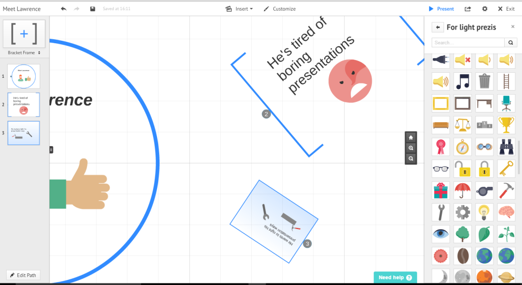
When you first open a new Prezi, there is simply a circle frame in the middle of a zoomable, seemingly infinite white background—a blank canvas on which you can paint your presentation. You can insert tons of icons, shapes and stickers, create frames of all types and sizes, add your own pictures and videos and then rotate all those objects any which way you want—an endless collection of possibilities! This was the rampant over-excitement phase: “I’ll put a bracket here and a circle there. Oh wait, let me turn the circle 196 degrees (not 180). I’ll insert this and I’ll insert that”…NUS at its finest.
It’s great Prezi is so customizable but just because you can put a rotated circle after a bracket doesn’t mean you should—it’s important to think of the implications of your objects so you can maintain a consistent “look and feel” throughout your presentation. Just because you have so many tools and a giant space on which to use them doesn’t mean you should use every feature all the time. Think about what is best for your presentation and how specific elements can enhance the message you are trying to communicate.
2. Size matters
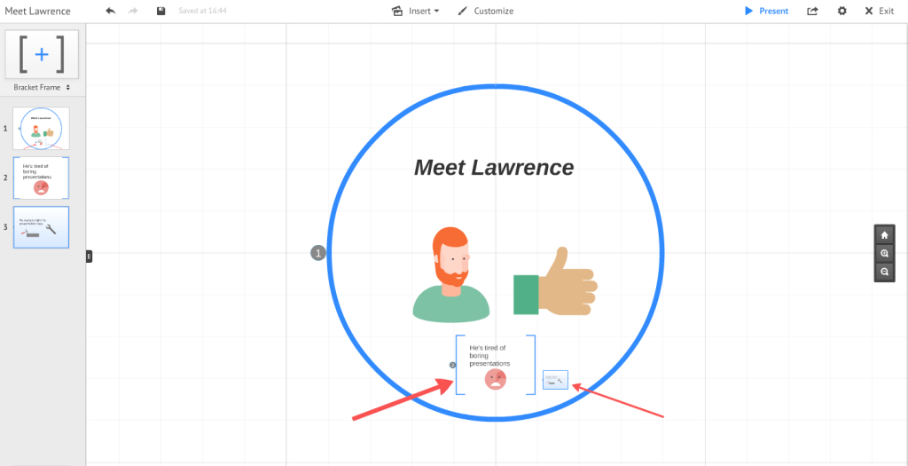
When you first begin experimenting on the Prezi canvas, you may find yourself sitting with your mouse on a circle frame constantly resizing it to make it bigger and smaller for minutes on end…I’m guilty of that! It is so cool it’s honestly hard not to do at least once. Before long you’ll have 10 different frames of 10 different sizes. From an artistic standpoint that may not be a problem, but when you’re presenting you’ll create constant movement and zooming as you progress between frames.
It’s important to understand early on that zooming within Prezi occurs automatically based on the size of the frames you create. While this is a great feature, it can often take a while for new users to understand the implications of their designs on the canvas movement. As a general rule, keep frame sizes similar while you’re on one topic and save major zooms and movements for intros, topic changes or “big reveals” at the conclusion of the presentation. It can be confusing (or even nauseating) if you are constantly zooming in and out throughout your entire presentation.
3. It’s all relative
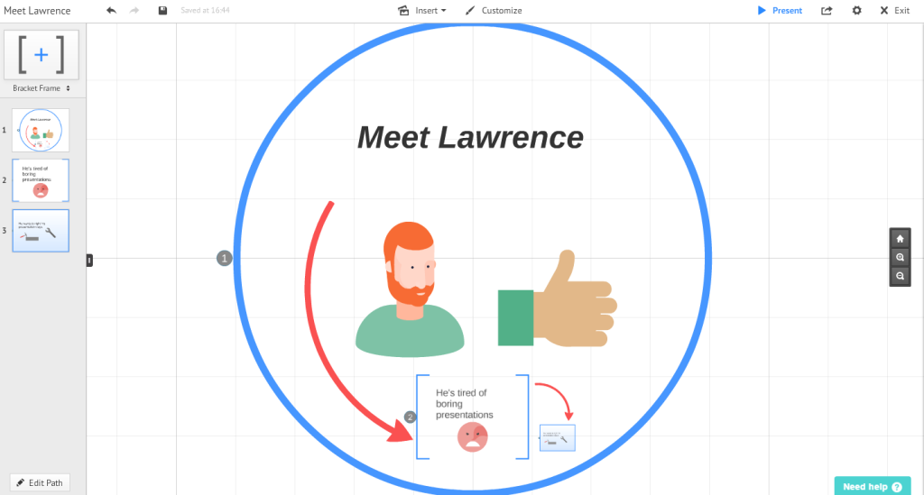
With a blank white canvas, the (virtual) sky is the limit. The space within Prezi allows you to show relationships: To show content as a group, you can place it close to other content. To show it as a part of a broader topic, you can place it smaller within the topic. You can put something inside of or next to or underneath or on top of or around or before or near or far or…. sorry, I got caught up in the prepositions there!
What it means is where and how you place presentation content relative to other content is important. While the essentially infinite space of Prezi can be one of the most intimidating features for beginners, it can also be one of the most exciting. Use it to your advantage! Divide your content into sections, place them relative to one another in the context of your presentation and add categories within those sections. Organize your content so you can logically take advantage of the spatial relationships within Prezi (it definitely helps if you brainstorm the layout with a paper and pencil before you even login to Prezi). If you’re mindful of what goes where, how it goes there and why, you’re setting yourself up for a fantastic presentation.
4. GO BACK
The UNDO button is in the top left corner. I needn’t say more but I shall.
• Don’t freak out if you delete some of your content—it can happen easily. Just hit undo.
• DON’T CLOSE YOUR BROWSER! If you accidentally delete something and hope that closing your browser will somehow bring it back, it most likely won’t. Prezi is a cloud-based platform that autosaves as you design your presentation, so closing your browser doesn’t revert your presentation back to an old version. You also lose the history of your undo button for that session once the browser / tab is closed.
• Make a copy! Every time you start working on a new version of your presentation, it’s a smart idea to use the “Save a Copy” button in the Prezi preview window to backup the previous version you’ve created. That way you always have your older versions accessible if anything goes wrong while you’re updating your presentation.
Want to see my first creation? Check it out here!
All in all, Prezi is a great platform that’s relatively simple to use once you get the hang of it. Being a new user myself though, I know how intimidating it can be at first. I’ve been through all the symptoms of NUS—from excitedly overusing every feature to then trying to fix my chaotic frame layouts and instead accidentally deleting everything and having to start over (face palm). In my beginner’s experience I came up with these 4 insights that every new Prezi user should know—hopefully they help you make your first Prezi experiences great and curb your symptoms of NUS so you can start wow-ing your audiences with engaging presentations!
If you’re looking for more tips, check out our free Prezi training videos.


