Prezi Releases New Charts Feature!
Interested in Data Visualization? Check out our new article 4 Examples Why Prezi is Superior to Slides for Data Visualization
The timing couldn’t be better…
With the end of the year looming overhead, here we all sit in front of our presentation decks preparing for the big meeting. As much as we focus on creating an engaging and visual presentation, there is no getting around some less-than-appealing content – most often data.
Year-in-review presentations often mean performance metrics, sales figures, budget reviews and robust graphical content that simply must be included. If you’re an avid Prezi user, you’ve probably found creating charts and graphs on the canvas to be a challenge. Previously there was no live-editing feature for charts in Prezi, a major hindrance for users familiar with the advanced data capabilities in PowerPoint or Keynote. Prezi’s recommended workaround was to create charts manually, a process that was time-consuming and difficult to update.
But that is all changing!
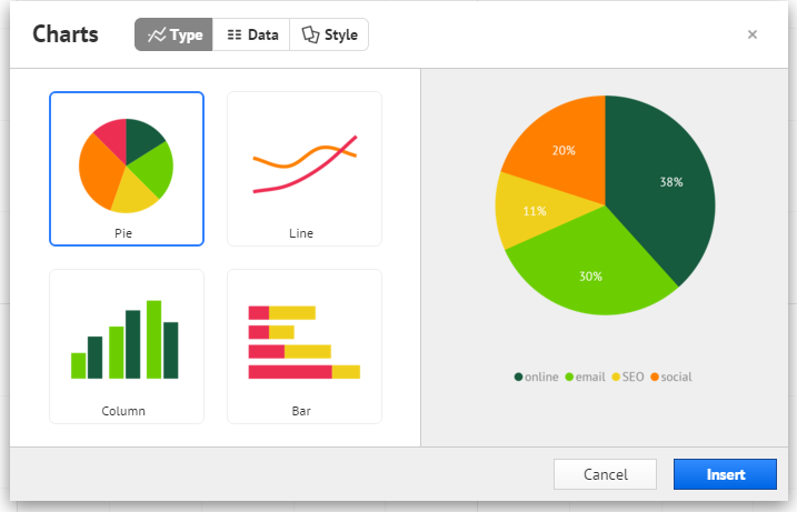
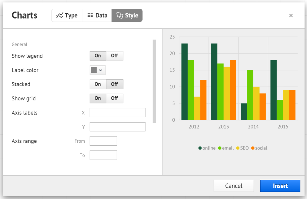
Say hello to Prezi’s new chart feature!
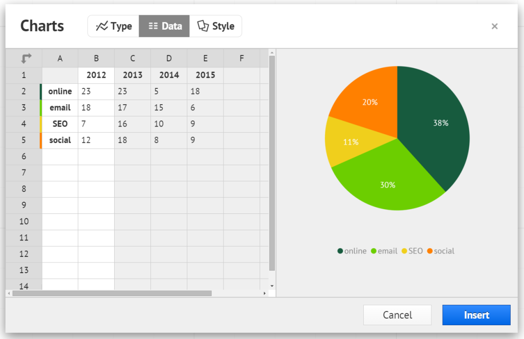
With Prezi’s charts feature you can now insert pie charts, line graphs and column and bar charts directly into your Prezi presentation! The options allow you to easily customize your charts, changing the colors and manipulating your data “live” on the Prezi canvas. You can easily match the colors and visual aspects of your charts with the rest of your content. Make all of your data look great with this new feature in Prezi! It is currently on limited availability but will be coming to all Prezi accounts in the upcoming days.
We’re excited to see how the Prezi canvas continues to evolve by adding new features…and now you must excuse us, we have to get back to creating those year-end review presentations!
To get more information on using the Prezi canvas, check out our Training Page.
To see our Prezi designs in action, check out our Portfolio Page.