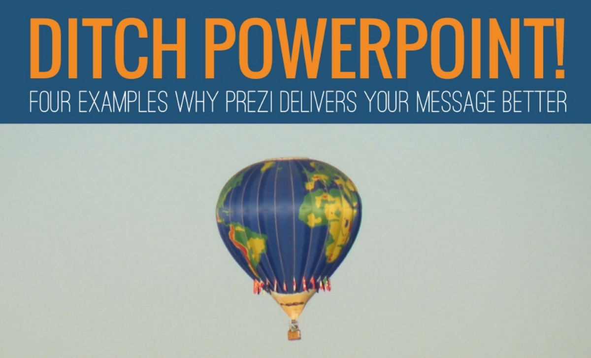
Ditch PowerPoint! 4 Examples Why Prezi Delivers Your Message Better
Want more exciting “Before & After” examples of slides converted to Prezi? Check out our new article 4 Examples Why Prezi is Superior to Slides for Data Visualization
Microsoft PowerPoint debuted in 1990—before many entering the workforce today were born.
In capable hands, it can still be an effective presentation tool. For too long though people have considered PowerPoint the only presentation option and have turned to its comfortable slide templates for anything and everything.
With the era of cloud computing, numerous new platforms have emerged onto the presentation software scene. Many tout themselves as “PowerPoint Killers,” yet still rely on the familiar slide-based architecture we’ve experienced for decades.
As a company that works on presentations daily, Prezi has stood out to us as a legitimately innovative platform and exciting new approach to presentations. Prezi allows presenters to visually convey ideas and concepts through an infinite canvas in ways slide-based tools cannot.
Instead of an exhaustive list of feature comparisons, we’d like to share four real-world presentation examples showing how Prezi can help you better deliver your message—because ultimately, shouldn’t that be the goal of any new presentation tool?
1. Organize Your Ideas: Build Your Concept and Show the “Big Picture”
Our research has shown audiences prefer coming along for the ride versus being run over.
Too often, presenters start flinging slides at an audience without providing them a roadmap for the presentation and its topics. Even for presenters who do share an introductory outline slide, the information is often forgotten once the presentation progresses forward.
In Prezi, frames can be put inside of other frames—meaning a presentation can start with a “zoomed out” preview of the entire presentation and all its content and then zoom in on each section to reveal the details. Once a section is complete, the presenter can zoom back out to the overall frame and then zoom into a new section.
Instead of a seemingly endless slideshow, the audience can clearly recognize transitions between sections and can follow the entire roadmap for the presentation journey.
2. Build On Your Point: Zoom and Shift to Show Frame Relationships
Slides are by nature independent of one another. You complete one slide, you move onto the next. Efforts to standardize presentations with color templates and company branding make slides look similar, but they don’t help presenters demonstrate relationships with the presentation content.
Prezi ditches slides for frames. Frames can be placed anywhere on the canvas, meaning the transition from one frame to another can move up, down, left, right, zoom in, zoom out, spin, rotate and progress in potentially any direction.
Abuse of this privilege can result in motion sickness for the audience, but used properly, movement between frames can establish many types of relationships—big picture versus details, subtle transitions versus major transitions, recaps and summaries, multiple parts of one overall topic, outliers and of course, grand finales (see example 4).
3. Emphasize Graphics: Focus on Parts of a Graphic for Clarification
Graphics and charts have a tendency to get complicated—by the time a presenter has shrunk a chart down enough to fit every label, citation and reference key on the slide, the core content can become practically indecipherable to an audience.
Some presenters also insist on showing multiple graphics on a single slide, theoretically attempting to draw comparisons or show supporting information but realistically ensuring the audience will have a very difficult time comprehending the information without a magnifying glass.
Prezi’s zooming capability is a major asset when it comes to graphics.
A presenter can show a frame with multiple graphics on it, then zoom in on each graphic individually and perhaps even on specific elements of a graphic so the audience can easily understand what’s being shown. Afterward, the presenter can zoom back out to show side by side comparisons of the graphics—much more meaningful when the graphics have been examined individually first.
4. Leave an Impression: Add a “Big Reveal” to Wow Your Audience
A great example of a “big reveal” comes from the 1997 sci-fi thriller Men in Black: At the end of the movie, actor Will Smith is shown buying a quick hotdog in Manhattan and driving away in his car as the “camera” begins to continuously zoom out—progressively revealing New York City, the United States, the entire globe, the planets of the solar system, the Milky Way galaxy and numerous other galaxies—all encapsulated in a single marble being played with by an alien in a marbles game. Talk about leaving an impression!
With Prezi, you can create a similar effect even if you don’t have a $90 million budget! Instead of ending with a dull “Questions?” slide, you can zoom out to show the content from your entire presentation and even incorporate it into some overall scene—a branch of a tree, a place on a map, a screen on a computer or mobile phone…all helping you reinforce your presentation theme and leaving the audience with a memorable impression.
To see additional examples of our projects, check out our portfolio here!