Presentation Foundations Series with Jill Konrath: Developing Your Message
Struggling to keep your audience engaged?
In part one of our two-part “Presentation Foundation” series, we wanted to take you back to the basics: a strong message. The video below features Puffingston director Luke Goetting and sales expert Jill Konrath discussing tips and techniques required to craft an engaging sales presentation.
In the video, Goetting discusses how to develop a captivating presentation by considering your purpose before making slides, imagining your content as a flowing story and keeping “big picture” ideas easy for the audience to track.
<iframe width="560" height="315" src="https://www.youtube.com/embed/ODBZete4Vzs?rel=0&showinfo=0" frameborder="0" allow="autoplay; encrypted-media" allowfullscreen></iframe>
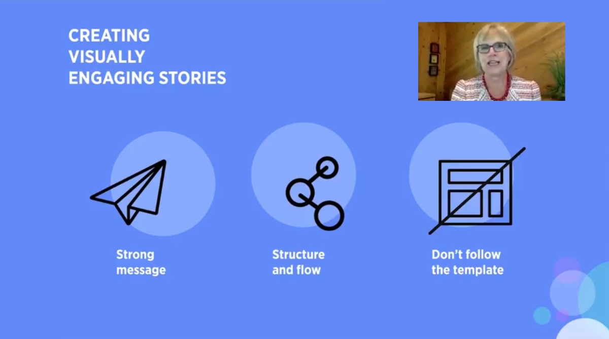
Take a step back and consider what you’re trying to accomplish
A strong message is crucial to getting your point across. If your content is relatable to your audience, they’re going to listen up and be more engaged. If you dive into the content creation process with no plan in place, your message will suffer and the audience will have a more difficult time connecting with you.
Think of your presentation as a flowing story, not a series of independent slides
Get rid of the template!
Break from the standard approach and do what makes sense for you and your story: this is your presentation and you don’t want to be stuck in a content framework that doesn’t fit. Slide templates that seem helpful can actually be detrimental to communicating your message when they guide you to repetitive content headers, lengthy bulleted lists and minimal space for photos and graphics.
Drawing ideas out on a whiteboard or writing your story on flashcards are simple techniques that can help you better develop your narrative and experiment with the story’s flow until you find the ideal structure. From there, it’s easier to begin crafting your visual aids. Remember to make the tool work for you, not the other way around!
Context drives comprehension
One of the biggest challenges for audiences is keeping track of a presentation’s logic and flow when all the slides look the same and have no clear hierarchy. When they lost track of your point in a sea of endless slides, they’ll lose interest altogether.
Visual cues like “big picture” pages with key themes listed, agenda progress slides and section headers are simple ways to help your audience keep the overall perspective in mind.
Not having the right tool is no longer an excuse
Prezi’s zooming technique has long been an effective way of demonstrating visual hierarchy to an audience: by zooming in and out on content, its easier to track the presentation structure.
This type of effect has traditionally been more difficult to achieve in slideshows, but new features in the Office 365 version of PowerPoint bring expanded visual communication capabilities: Zoom is a feature that allows presenters to move in and out of content in a way that’s similar (albeit not quite as elegant) as Prezi, while Morph is a smart transition that shows how content flows from slide to slide as the presentation progresses.
Check out part two of our series where we show you how to measure your presentation effectiveness using analytics!
Key Takeaways:
-Consider your presentation’s purpose before jumping into slide creation
-Treat your slideshow as a flowing story, not a series of independent slides
-Make it easy for the audience to follow your “big picture” ideas throughout the slideshow
Check out part two of our Presentation Foundation Series: Using Prezi Analytics to Measure Presentation Effectiveness
Interested in learning more? Want us to help you create a presentation that will WOW your audiences?
Connect with us or check out our Presentation Design or Prezi Training pages!